About the project
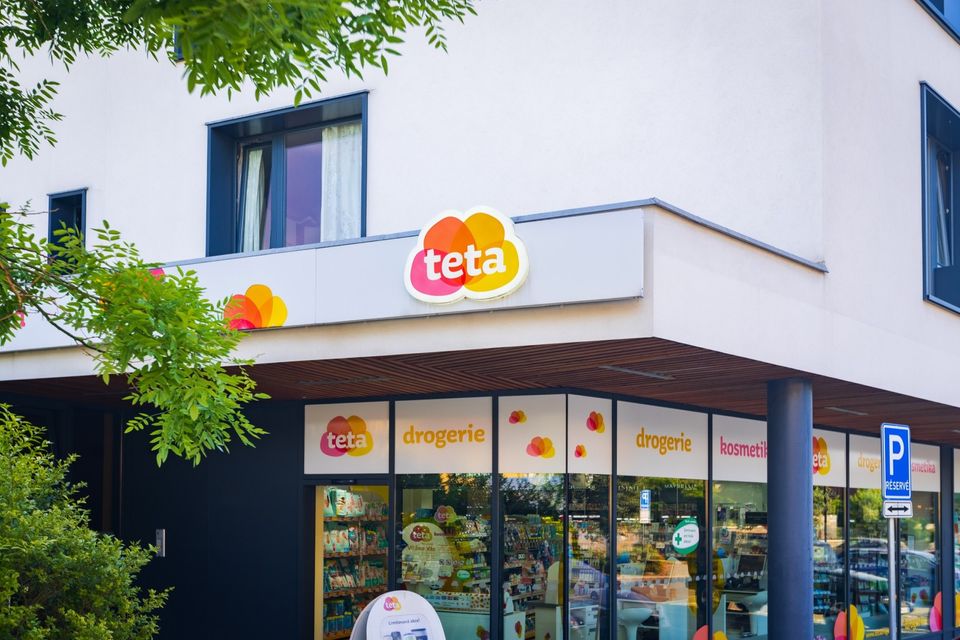
We continue to work on our concepts even after they have been put into operation. The world of retail is constantly changing. So are customers. To keep our Teta drugstore concept up to date, we have modified selected parts to better meet the new needs of the store – that is, to make those parts more visible to shoppers.
By unifying all decorative cosmetics stands, we have created a cohesive look for the section. This better ties in with the overall design of the store. We have used lighting elements to support communication with customers, who will now notice this product range more easily.
By installing side panels, we have demarcated the health section and elevated it above the other product ranges. This makes the section stand out subtly. A bright green cross visible from all sides aids navigation and attracts customers from further away in the store.
Last but not least, we refreshed the look of the existing skin and hair care stands. To do this, we used new terminology and graphics. For example, we divided hair dyes according to the effect of each product.
"I want to be seen!" or "I want perfect coverage and extra care!" proclaim the signs above the individual types of hair dye. Even from a distance, customers can see where to go if they are looking for a bolder shade or a nourishing color.
The main goal of the refit was to revitalize the store's interior and adapt the concept to new trends. Since the original concept for Teta stores was also our work, it was easier for us and the client to implement the changes.


Take your project to the next level
At MORIS design, we combine architecture, design & build, and fit-out with our own production and modern technologies – from concept to finished space.
Want to know more?
Adam Klofáč 📞 +420 723 387 546